Keeping track of your actual internet speed over time, using R and Speedtest-CLI

I thought this only happened in my country (Perú), but it turns out it happens to people around the globe, you contract an Internet Service Plan that offers up to X Mbps, where X is an impressive value (relative to each country’s context), but the catch is in that word, Up to.
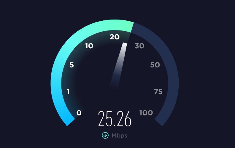
If it makes you feel better, it could be worse if you lived in another country, trust me, I know... pic.twitter.com/Rm3J2J2Cdz
— Andrés Castro Socolich (@Andresrcs) January 16, 2020
In reality, you end up getting far slower download speeds than advertised, and ISPs (Internet Service Providers) get away with this because they only test download speed with you once when they install the service (suspiciously it works great at that moment) and most people don’t bother to keep track of their download speeds over time because it would be impractical to manually perform speed tests every short period of time, luckily there is a better way, Ookla’s Speedtest service provides a Command Line Interface (CLI) that allows you to perform tests from your system terminal enabling you to set up automated scripts to collect connection performance data.
In the next lines, I’m going to show you how to do this from R and get the results in the form of nice plots you can tweet to your ISP to annoy them a little bit. 😆
Getting Your Setup Ready
We have to set up our working environment for this project. First, we need a machine that is constantly powered on and connected to the same internet connection you want to test so it can perform the tests and store the data, it could be any computer connected to your local network but the most practical (and cost-effective) solution I have found is using a Raspberry Pi SBC so I’m going to use one for this project.
Since you are reading an R related article I’m going to assume you already have your basic R environment set, so we are going to focus on the additional stuff, we need to install the Speedtest Command Line Interface (CLI), if you are in a Linux machine, you can do it with this commands on a system terminal:
✏️ There are installation instructions for other OSs on the Speedtest web site
sudo apt-get install curl
curl -s https://packagecloud.io/install/repositories/ookla/speedtest-cli/script.deb.sh | sudo bash
sudo apt-get install speedtest
✏️ Check if you have an older python version of the CLI installed in your system and make sure to uninstall it with this command
sudo pip uninstall speedtes-cli, since it could cause conflicts with the newer official version. This happened to me and I didn’t notice 😳, thanks to @jasongrahn for the heads up.
Gathering Data
Now we can write an R script that retrieves the test output, parses the content and stores the data. In this example I’m going to store it into a PostgreSQL database but you could choose other options like another SQL server, Google Sheets, a CSV file, etc. I have called this script file speedtest_job.R.
#! /usr/bin/env Rscript

# Data adquisition
output <- read.csv(
  text = system(
    command = "speedtest -f csv --output-header --accept-license",
    intern = TRUE
  )
)

results <- data.frame(
  stringsAsFactors = FALSE,
  time = as.POSIXct(Sys.time()),
  ip = system("curl ifconfig.me", intern = TRUE), # This field is no longer provided on the new CLI version
  ping = output$latency,
  download = output$download * 7.629395E-6, # Convert to Mbps
  upload = output$upload * 7.629395E-6, # Convert to Mbps
  isp = "movistar" # This field is not provided on CSV format
)

# Data storing
con <- dbConnect(drv = odbc::odbc(),
                 driver = 'PostgreSQL ANSI',
                 server = 'localhost',
                 database = 'internet', # Name of the database on the sql server
                 port = 5432,
                 uid = Sys.getenv('MY_UID'),
                 pwd = Sys.getenv('MY_PWD'),
                 encoding = 'utf8')

DBI::dbAppendTable(
  conn = con,
  name = "speed_test", # Table name on the sql server
  value = results
)

odbc::dbDisconnect(conn = con)

# Cleaning log files
unlink(x = "*.log", force = TRUE)
Now we can schedule a cron job to run this script on regular intervals, I’m going to set it to run once every hour running this commands on a system terminal:
✏️ This can also be done from R using the
cronRpackage.
env EDITOR=nano crontab -e
  # Add this line
  0 * * * * /usr/local/lib/R/bin/Rscript '/home/pi/speedtest_job.R' >> '/dev/null' 2>&1 # Change the file path as needed
sudo service cron reload
After letting some time to pass for registers to accumulate, we can fetch data from the server with a SQL query:
library(odbc)

con <- dbConnect(drv = odbc::odbc(),
                 driver = 'PostgreSQL ANSI',
                 server = Sys.getenv('MY_REMOTE'),
                 database = 'internet',
                 port = 5432,
                 uid = Sys.getenv('MY_UID'),
                 pwd = Sys.getenv('MY_PWD'),
                 encoding = 'utf8')

query <- "
    SELECT *
    FROM public.speed_test
    ORDER BY time
    "

raw_data <- dbGetQuery(
  conn = con,
  statement = query
)

dbDisconnect(con)
Visualizing the Data
Now that we have some data to work with we can start making some plots. Since this is not an article about ggplopt2 I’m not going to get much into details about this part, I’m just going to show you some interesting plots you can get about your internet connection speed.
In Figure 1 we can see how observed download speeds distribute, letting aside the fact that the advertised speed is already slow (for developed countries standards), this reveals a pattern that is very common, most of the time you get download speeds that are much slower than advertised by the ISP and even so slow that defaults the terms of your contract, like in my case (I actually used this image to file a complaint).
library(tidyverse)
library(xkcd)
library(lubridate)
library(tibbletime)
library(scales)

# These are my personal theme settings you can ignore them if you prefer
theme_set(
  theme_gray() +
    theme_xkcd() +
    theme(legend.position = "right",
          plot.title.position = "plot",
          axis.title.x = element_text(margin = margin(t = 10)),
          axis.title.y = element_text(margin = margin(r = 10)),
          axis.text.x = element_text(angle = 20, hjust = 1, vjust = 1),
          plot.margin = margin(10, 10, 10, 10),
          text = element_text(family = "Cloud Calligraphy"))
)

color <- c("Mode" = "#008B00", "Parameters" = "orange")

raw_data %>%
  ggplot(aes(x = download)) +
  geom_histogram(binwidth = 0.1, fill = "#00B2EE") +
  geom_vline(aes(xintercept = 20, color = "Parameters"),  linetype = "dashed") +
  geom_vline(aes(xintercept = 8, color = "Parameters"),  linetype = "dashed") +
  stat_bin(geom = "vline",
           aes(xintercept = stat(ifelse(count == max(count), x, NA)),
               color = "Mode"),
           binwidth = 0.1) +
  annotate("text",
           x = c(8.4, 20.4),
           y = c(8, 8),
           label = c("Guaranteed Minimum Speed", "Advertised Speed"),
           family = "Cloud Calligraphy",
           size = 5,
           angle = 90) +
  stat_bin(geom = "label",
           aes(label = stat(ifelse(count == max(count), round(x, 1), NA))),
           binwidth = 0.1,
           family = "xkcd",
           color = "#008B00",
           vjust = -0.2) +
  labs(title = 'HISTOGRAM OF OBSERVED DOWNLOAD SPEEDS',
       subtitle ='ISP: MOVISTAR 20 Mbps',
       x = 'Speed (Mbps)',
       y = 'Frequency',
       colour = '') +
  scale_x_continuous(breaks = seq(0, 22, by = 2),
                     limits = c(0, 23)) +
  scale_colour_manual(values = color) +
  coord_cartesian(clip = 'off') +
  NULL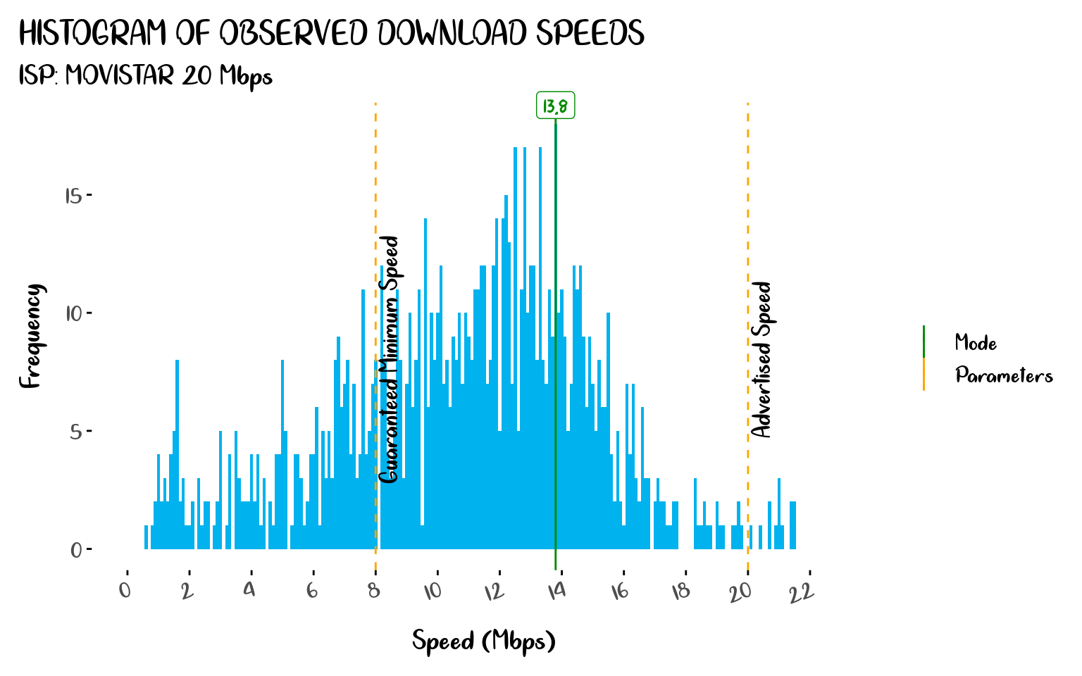
Figure 1: Histogram of Observed Download Speeds
With figures 2 and 3, we can show how often the download speeds fall below the minimum guaranteed speed.
colors <- c("Mean Speed" = "blue",
            "Parameters" = "orange",
            "Fault" = "red",
            "Download Speed" = "#00B2EE")

plot_data <- raw_data %>%
  as_tbl_time(index = time) %>%
  collapse_by('1 hour', side = 'start', clean = TRUE)

mean_speed <- plot_data %>%
  pull(download) %>%
  mean() %>%
  round(1)

plot_data %>%
  ggplot(aes(x = time, y = download)) +
  geom_line(aes(color = "Download Speed")) +
  geom_point(data = plot_data %>% filter(download < 8),
             aes(color = "Fault")) +
  geom_point(data = plot_data %>% filter(download < 8),
             shape = 1,
             color = "red",
             size = 5) +
  geom_hline(aes(yintercept = 20, color = "Parameters"),  linetype = "dashed") +
  geom_hline(aes(yintercept = 8, color = "Parameters"),  linetype = "dashed") +
  geom_hline(aes(yintercept = mean_speed, color = "Mean Speed")) +
  annotate("text",
           x = as.POSIXct(c("2019-06-24 11:00:00 UTC", "2019-06-24 11:00:00 UTC")),
           y = c(7, 19),
           label = c("Guaranteed Minimum Speed", "Advertised Speed"),
           family = "Cloud Calligraphy",
           size=5) +
  geom_label(x = as.POSIXct("2019-08-01 11:00:00 UTC"),
             y = mean_speed,
             label = mean_speed,
             family = "xkcd",
             show.legend = FALSE,
             inherit.aes = FALSE,
             color = "blue")  +
  labs(title = 'OBSERVED DOWNLOAD SPEEDS',
       subtitle ='ISP: MOVISTAR 20 Mbps',
       x = 'Date',
       y = 'Speed (Mbps)',
       color = 'Legend:') +
  scale_x_datetime(date_breaks = "5 days",
                   labels = label_date_short(),
                   expand = expansion(c(0, 0.04))) +
  scale_y_continuous(breaks = seq(0, 22, by = 2), limits = c(0, 23)) +
  scale_colour_manual(values = colors) +
  coord_cartesian(clip = 'off') +
  NULL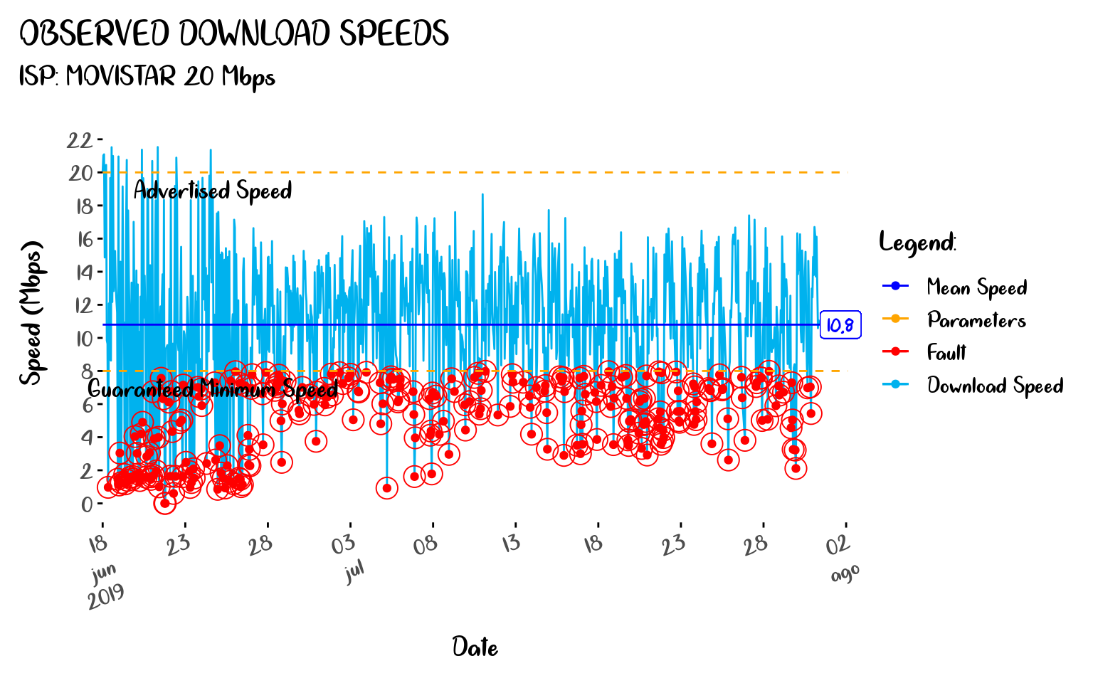
Figure 2: Observed Download Speeds
faults <- plot_data %>%
  mutate(event_type = ifelse(download <= 8, 'fault', 'normal')) %>%
  filter(event_type == 'fault') %>%
  mutate(tbf = as.numeric(as.period(interval(lag(time), time),
                                    unit = 'seconds')) / (3600)) %>%
  tail(-1)

faults %>%
  ggplot(aes(x = '', y = tbf)) +
  geom_boxplot(fill = '#FF303094') +
  coord_flip() +
  geom_label(y = median(faults$tbf),
             label = paste(round(median(faults$tbf),1), 'h'),
             family = "xkcd",
             show.legend = FALSE,
             color = "blue") +
  labs(title = 'BOXPLOT OF TIME BETWEEN FAILURES',
       subtitle ='ISP: MOVISTAR 20 Mbps',
       x = '',
       y = 'Hours') +
  NULL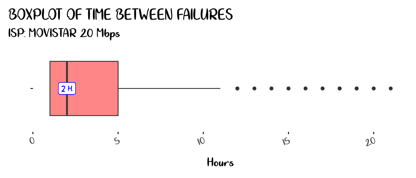
Figure 3: Boxplot of Time Between Failures
And with Figure 4 we can find out when the peak hours occur, so we can know at what time of the day is more likely for us to experience slow internet speeds.
hour_data <- plot_data %>%
    as_data_frame() %>%
    mutate(time = format(time, "%H:%M"))

hour_data %>%
  ggplot(aes(x = time, y = download)) +
  geom_boxplot(fill = "#00B2EE") +
  geom_point(data = hour_data %>% filter(download < 8),
             shape = 1,
             color = "red",
             size = 5) +
  geom_hline(aes(yintercept = 20), color = "orange",  linetype = "dashed") +
  geom_hline(aes(yintercept = 8), color = "orange",  linetype = "dashed") +
  annotate("text",
           x = c("04:00", "04:00"),
           y = c(7, 19),
           label = c("Guaranteed Minimum Speed", "Advertised Speed"),
           family = "Cloud Calligraphy",
           size = 5) +
  labs(title = 'BOXPLOT OF OBSERVED DOWNLOAD SPEEDS BY HOUR OF THE DAY',
       subtitle ='ISP: MOVISTAR 20 Mbps',
       x = 'Hour',
       y = 'Speed (Mbps)') +
  scale_y_continuous(breaks = seq(0, 22, by = 2),
                     limits = c(0, 22)) +
  coord_cartesian(clip = 'off') +
  NULL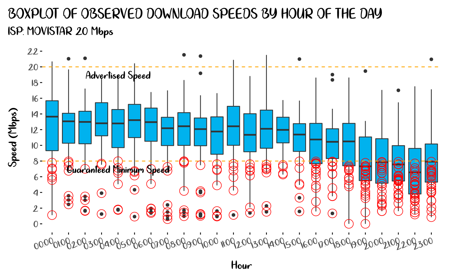
Figure 4: Boxplot of Observer Download Speeds by Hour of the Day
Once you have data, plotting possibilities are only limited by your imagination, so I’m going to stop here, I hope you have enjoyed reading this article and you are motivated now to start monitoring your own internet speed. Have fun! see you soon!.